
Crafting Smooth Transitions That Feel Natural
Learn timing curves, easing functions, and duration principles that make animations feel polished and responsive.
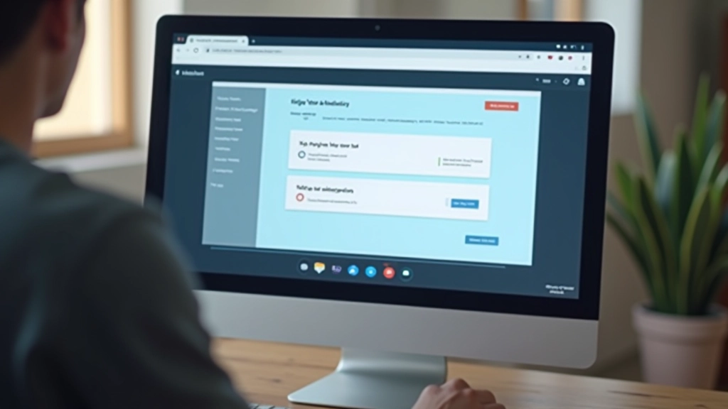
Read ArticleButton states, loading indicators, and validation animations — how small movements communicate system status and guide user actions effectively.
Users don’t always know what’s happening when they interact with an interface. A button click seems instant, but behind the scenes there’s form validation, API calls, or data processing. Without visual feedback, people wonder: Did my click register? Is something loading? Did the form actually submit?
That’s where microinteractions come in. They’re the small animations and state changes that acknowledge user actions and communicate what the system is doing. A button that changes color when pressed. A loading spinner that spins while data fetches. A checkmark that appears when validation passes. These aren’t decorative — they’re functional communication tools.
The best microinteractions happen so naturally that people don’t consciously notice them. But when they’re missing? Users feel confused and uncertain. We’re going to explore how to design microinteractions that actually work.


When something takes more than a few hundred milliseconds, people need to know it’s working. A static loading indicator is boring and makes waits feel longer. A spinning loader or animated dots creates a sense of progress, even if nothing’s actually progressing.
The spinner itself should rotate smoothly. If it’s chunky or jerky, it feels broken. Use a 2-3 second rotation cycle — fast enough to feel active, slow enough to look smooth. Color matters. A spinner should match your brand or use a distinct accent color so people know it’s loading, not an error.
For longer operations, add context. Instead of just a spinner, show “Loading data…” or “Processing payment…” People appreciate knowing what’s happening. For really long waits (over 5 seconds), consider showing progress like “Step 1 of 4” or a percentage bar. It gives people confidence the operation will finish.
Pro tip: Add a subtle fade-in to loading indicators. They shouldn’t appear instantly if the operation finishes in under 200ms. This prevents the UI from flashing spinners for quick operations.

Forms are where microinteractions prove their value. When someone types an email address, you can validate it in real-time. Instead of waiting until they hit submit to discover it’s wrong, show them immediately. A red outline appears, maybe an error icon slides in, and helpful text explains what’s wrong.
The timing here is important. Don’t validate while they’re still typing. Wait about 500 milliseconds after they stop typing, then run validation. This prevents constant flickering between valid and invalid states. Nobody wants a form that yells at them while they work.
Success feedback is equally important. When validation passes, show it. A green checkmark, a subtle glow, or an icon appearing in the field. This reassures people they’ve done it right. On form submission, if everything passes, show a confirmation animation — maybe a success screen slides in, or a checkmark scales up. This celebrates the completion.
For errors, use color plus an icon. Color alone isn’t enough — colorblind users won’t see red. Add an error icon or warning symbol. Include specific error messages: “Password must be at least 8 characters” beats “Invalid password” every time.
Every interactive element should behave predictably. If buttons use a lift animation, all buttons should. If form fields show errors in red with icons, keep that pattern everywhere. Consistency builds user confidence.
Feedback animations should feel instant. Most microinteractions happen between 100-300 milliseconds. Slower than that and it feels sluggish. Faster than 80ms and people might miss it. Find the sweet spot.
Microinteractions shouldn’t require explanation. A button that changes color on hover is obvious. A barely perceptible opacity shift isn’t. Use contrast and movement to make feedback unmistakable.
Some users have motion sensitivity. Include a `prefers-reduced-motion` media query in your CSS. When this is enabled, animations should either be removed or replaced with instant state changes.
You don’t need JavaScript for most microinteractions. CSS transitions and the `:hover`, `:active`, and `:focus` pseudo-classes handle button states beautifully. For loading indicators and complex animations, JavaScript gives you more control.
A button hover state is just CSS. Define a `transition: all 0.15s ease` on the button, then change the background color on `:hover`. That’s it. The browser handles the animation smoothly. For active states, use `:active` to show immediate feedback on click.
Loading spinners are trickier. You could use an animated SVG or CSS keyframe animation. A spinning div with `animation: spin 2s linear infinite` works well. Make sure it’s accessible — add `aria-live=”polite”` so screen readers announce when loading completes.
Form validation benefits from JavaScript. You can validate on blur (when focus leaves the field) or on input with a debounced delay. Show error messages conditionally based on validation state. Libraries like Validate.js handle the heavy lifting, but plain JavaScript works too.

Microinteractions aren’t fancy add-ons. They’re essential communication. They tell users their actions registered, explain what’s happening, and guide them through processes. When done well, they’re invisible — users don’t think about them, they just feel like the interface is responsive and clear.
Start with button states. Get those right with consistent hover and active animations. Add loading indicators for any operation taking over 200 milliseconds. Implement form validation with clear error messages. These three fundamentals cover most scenarios.
Test your microinteractions on real devices at different speeds. A fast network might make loading indicators feel unnecessary. Slow networks might need longer timeouts before showing them. Watch real people use your interface. If they seem confused or hesitant, your feedback probably needs improvement.
Ready to level up your interface design? Start by auditing your buttons and forms. Do they provide clear feedback? Are animations consistent? Small improvements here compound into better user experiences.
Explore Smooth Transitions NextThis article provides educational information about microinteraction design principles and techniques. Design best practices vary by context, platform, and user needs. Always test your implementations with real users and consider accessibility requirements like motion sensitivity preferences. This content is informational and shouldn’t replace professional design consultation for critical applications.